Ideogram Neon Sign Ads: v2a, v2.0, v3.0 Compared

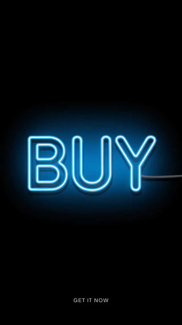
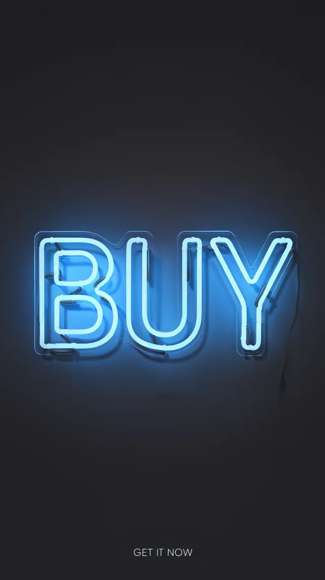
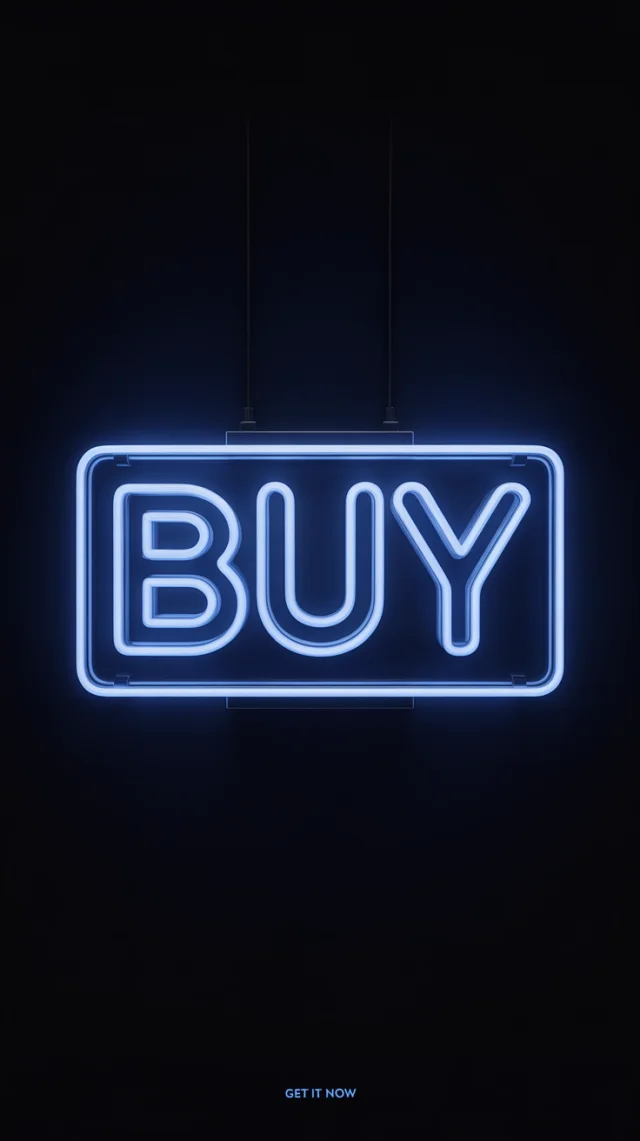
A minimalist product shot advertisement featuring a vibrant neon sign displaying the word "BUY" in bold, all-caps lettering, outlined in electric blue against a stark black background. The neon tubing is clean and precisely rendered, with a subtle glow emanating from the letters, casting soft shadows and highlighting the sign's smooth surface. The composition is centered and uncluttered, focusing solely on the neon sign with no surrounding elements to maintain a clean, impactful aesthetic, and a small tagline "GET IT NOW" appears subtly in a sans-serif font at the very bottom of the image. The overall mood is modern, urgent, and energetic, conveying a sense of immediate action and desirability with a striking contrast of blue and black, characteristic of contemporary advertising design.

Comparing Ideogram v2a, v2.0, and v3.0 for creating impactful neon sign advertisements. Each version offers distinct approaches to rendering the 'BUY' message and tagline, crucial for effective neon sign advertising. This Ideogram Neon Sign Advertisement Comparison explores their strengths in generating these visuals, helping you choose the best for your neon sign advertisement needs.

Image Comparison

Click any image to view full size

Version Comparison

Version V2a

Strengths

  • • Good initial capture of blue neon glow for advertisements.
  • • Consistently renders 'BUY' in bold capitals, suitable for a basic neon sign advertisement.
  • • Achieves stark black background effectively for neon sign impact.
  • • Some images hint at a product shot setup with reflections, aligning with advertisement goals.

Weaknesses

  • • Poor tagline ('GET IT NOW') rendering – often misspelled, illegible, or poorly placed for a professional neon sign advertisement.
  • • Neon tubing can appear less precise or 'clean' in some outputs.
  • • Lacks the polished look desired for high-end neon sign advertisements.

Best for: Quick concept visualizations for blue neon text where tagline detail is less critical in an advertisement.

Version V2.0

Strengths

  • • Improved realism in neon sign construction (mounts, wires) for advertisements.
  • • More consistent and legible tagline rendering than v2a, enhancing the advertisement's call to action.
  • • Strong neon glow and shadows enhancing the visual appeal of the neon sign advertisement.
  • • Good interpretation of 'BUY' in the desired style for effective advertising.

Weaknesses

  • • Backgrounds sometimes deviate from 'stark black' to dark grey/textured, potentially reducing advertisement contrast.
  • • Tagline can still be small or slightly unrefined for prominent neon sign advertisements.
  • • Realism details (wires) might clutter the minimalist aesthetic for some ad concepts.

Best for: Neon sign advertisements where a touch of physical realism is desired alongside the core message.

Version V3.0

Strengths

  • • Superior text rendering for both 'BUY' and 'GET IT NOW' tagline, crucial for clear neon sign advertisements.
  • • Achieves a highly polished, clean, and professional aesthetic ideal for modern neon sign advertisements.
  • • Excellent control of lighting, glow, and subtle shadows as per prompt specifications for impactful ads.
  • • Strongest adherence to minimalist and modern design for urgent and desirable neon sign advertisements.

Weaknesses

  • • Occasionally introduces framing elements (hanging sign) not explicitly requested, though often fitting for advertisements.
  • • Slight variations in sign construction (some with backing, some without) can occur.

Best for: High-quality, minimalist neon sign advertisements with perfect text and a contemporary, urgent feel.

Visual Differences

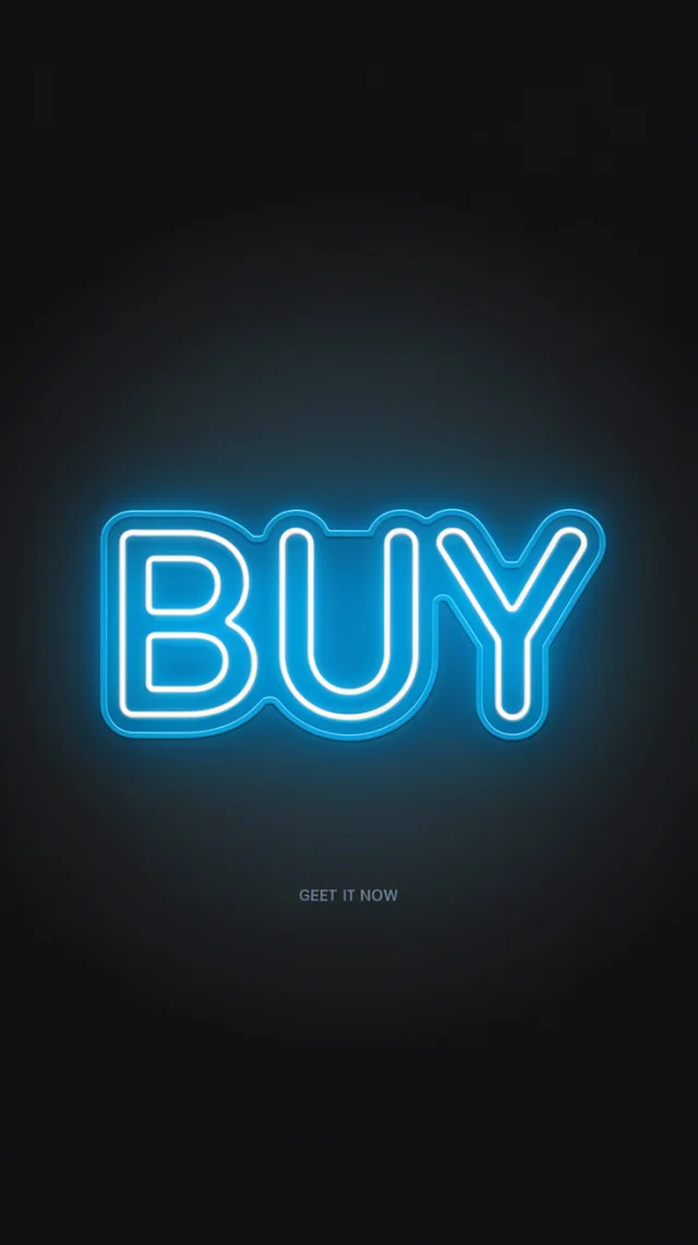
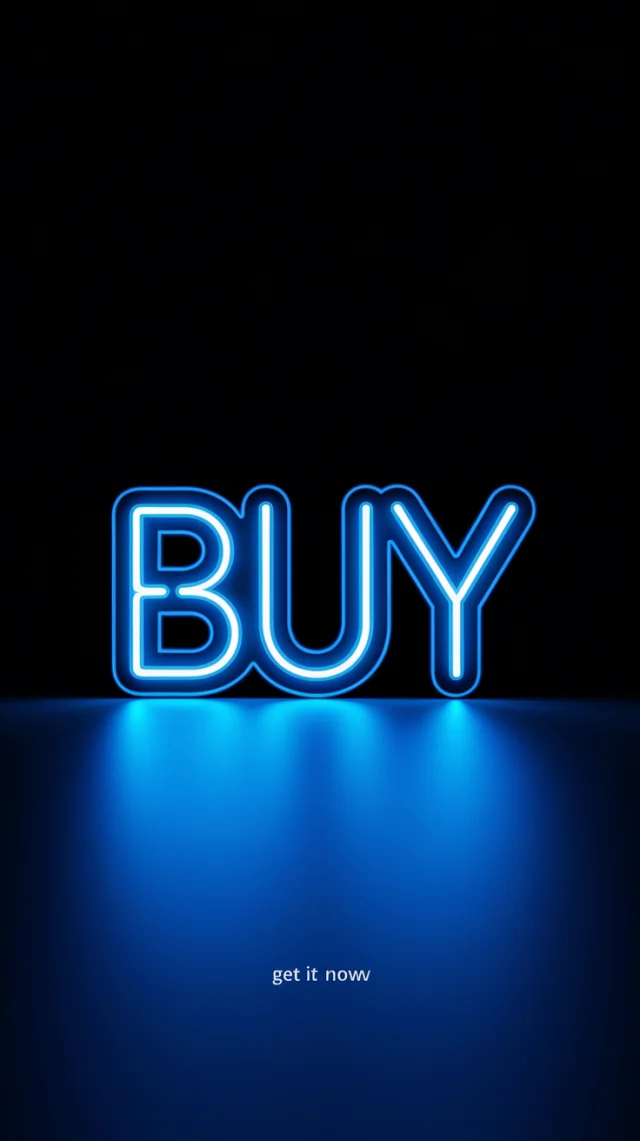
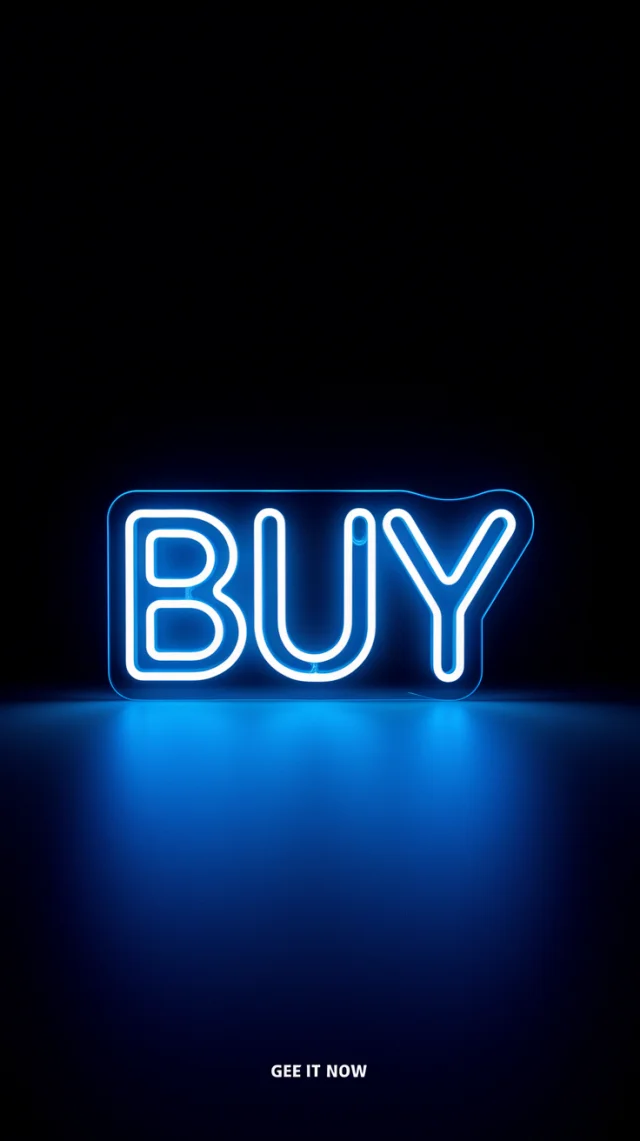
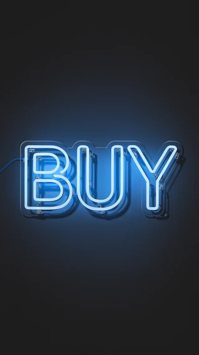
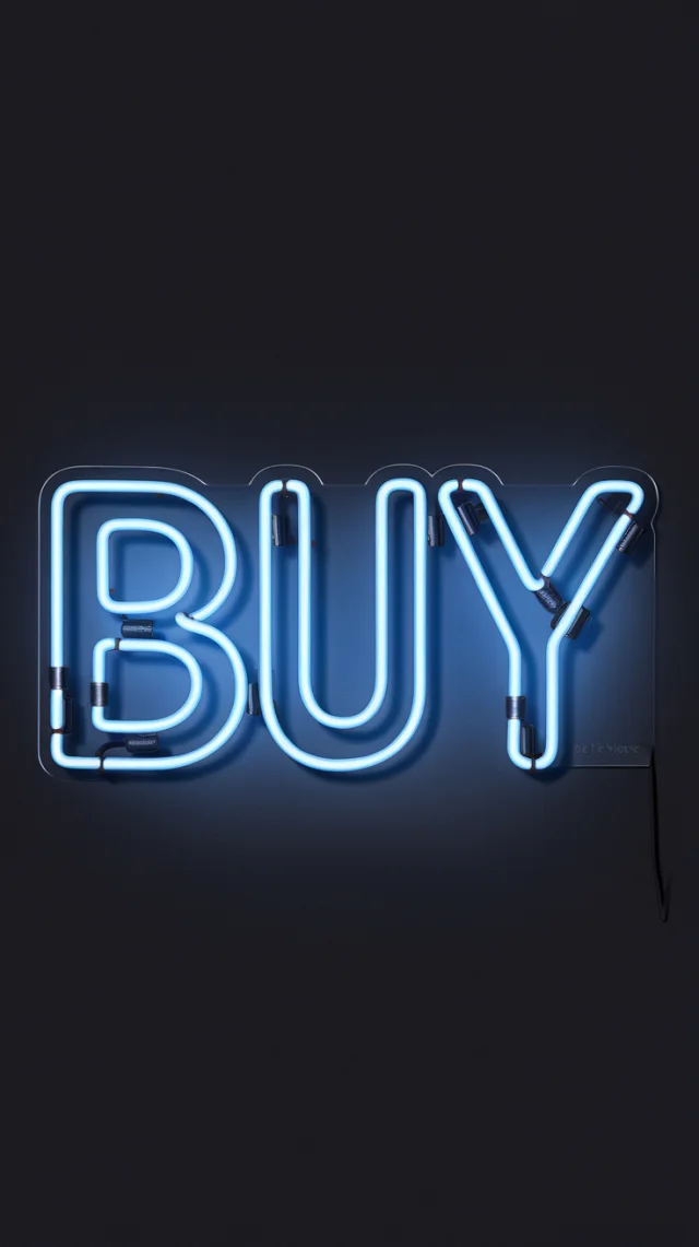
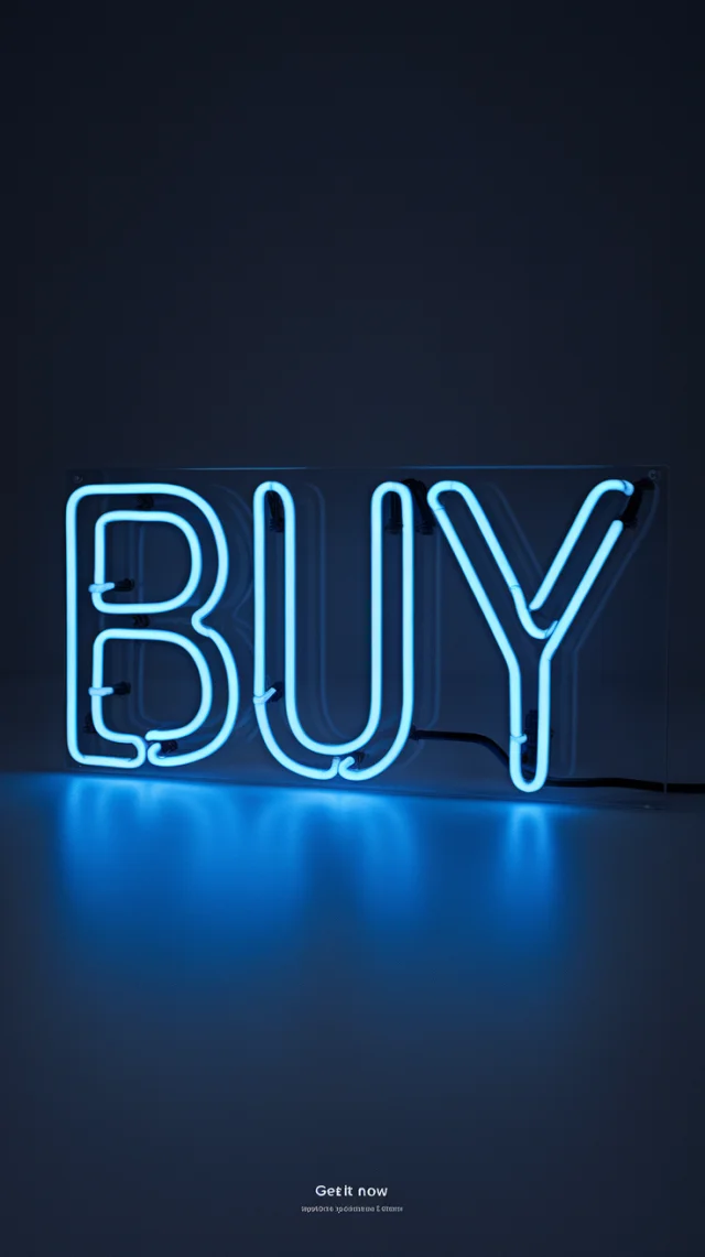
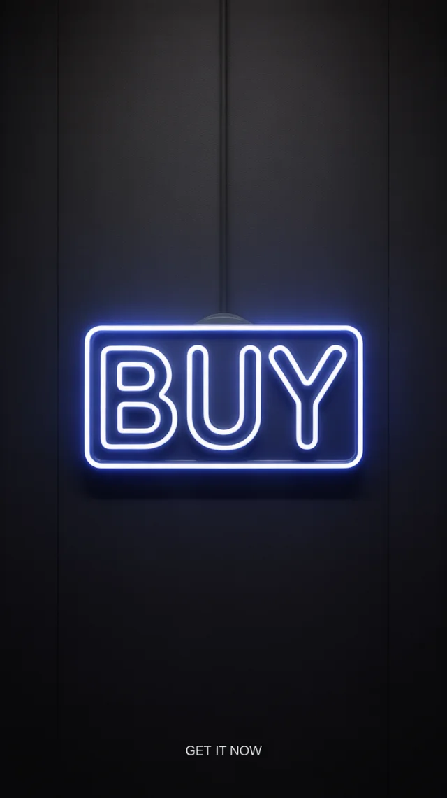
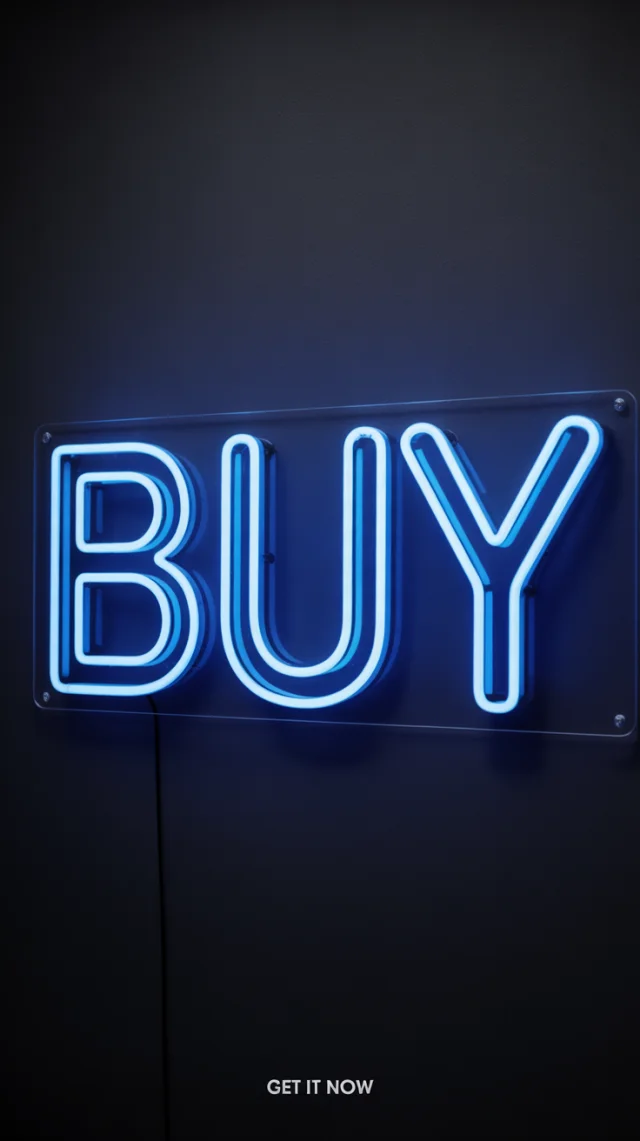
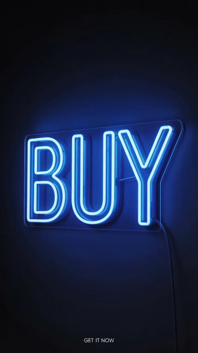
Visually, in this Ideogram Neon Sign Advertisement Comparison, v3.0 excels in delivering the crisp 'Blue Neon BUY Sign Ad' envisioned. Its text clarity for both the main word and tagline is superior. V2.0 offers more 'physical' realism with visible mountings, while v2a provides a more basic neon effect, struggling most with the tagline. V3.0 best captures the 'minimalist product shot' feel with clean lines and impactful lighting, making it ideal for clear neon sign advertisements. V2a and v2.0 sometimes have less refined text or backgrounds compared to v3.0's consistent starkness and precision, vital for a compelling neon sign advertisement.

Recommendation

For the Ideogram Neon Sign Advertisement Comparison, Ideogram v3.0 is the best version. It consistently produces clean, precise neon lettering, a perfectly rendered tagline, and the desired minimalist, modern aesthetic. Its superior text handling and lighting control make it ideal for creating an impactful neon sign advertisement that conveys urgency and desirability, directly aligning with the goals for a successful neon sign ad campaign evaluated in this Ideogram Neon Sign Advertisement Comparison.

Actionable Tips

Prompt Improvements

  • Specify tagline font size or prominence: e.g., 'tagline "GET IT NOW" clearly legible in a small, modern sans-serif font at the bottom center.' This helps ensure the tagline effectively supports the main message in your Ideogram Neon Sign Advertisement Comparison.
  • Clarify sign mounting for the advertisement: e.g., 'The neon sign is presented as if wall-mounted with no visible fixtures' or 'The neon sign is shown as a standalone object on a reflective surface' to guide the composition for the neon sign advertisement.
  • Add negative prompts for unwanted elements: e.g., '--no wires, --no complex backing plate' if an ultra-clean look is paramount for the neon sign advertisement aesthetic being compared.

Quick Tips

  • Emphasize 'minimalist' and 'clean rendering' for Ideogram v3.0 to leverage its strength in polished neon sign advertisement outputs.
  • Iterate with slight variations in tagline description if initial results aren't perfect; v3.0 offers good text control for neon sign advertisements.
  • Experiment with aspect ratios when creating your neon sign advertisement, especially if designing for specific platforms after this Ideogram Neon Sign Advertisement Comparison.

Use Cases

Images generated with these prompts are ideal for:

Digital Marketing Campaigns

Creating striking visuals for online ads, social media posts, or website banners featuring a 'Blue Neon BUY Sign Ad' call-to-action, as explored in this Ideogram Neon Sign Advertisement Comparison.

E-commerce Product Promotion

Designing urgent 'Buy Now' graphics for product pages or promotional emails, using the compelling nature of neon sign advertisements generated by Ideogram.

Brand Identity Elements

Developing modern, energetic branding assets or logos with a neon aesthetic, particularly for businesses aiming for a contemporary 'Blue Neon BUY Sign Ad' style.

Event Promotion Graphics

Crafting eye-catching posters or digital invites for sales events or product launches, using urgent 'BUY' neon sign imagery, ideally generated with findings from an Ideogram Neon Sign Advertisement Comparison.

Retail Signage Concepts

Visualizing in-store digital displays or window neon signs with a clear 'BUY' message, exploring neon sign advertisement ideas with Ideogram.

Presentation Slides

Adding impactful call-to-action slides in business presentations using a clean 'Blue Neon BUY Sign Ad' graphic, potentially inspired by an Ideogram Neon Sign Advertisement Comparison.