MidJourney’s Evolution of Synthwave Festival Poster Design

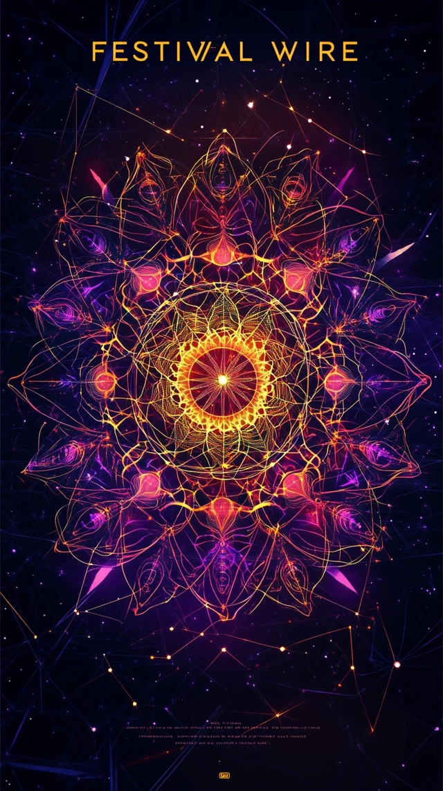
FESTIVAL WIRE" center stage in clean futuristic typography, AI-infused circuitry blending with floral mandalas and chill silhouettes, against a deep space purple and golden hour background, designed in a Philosophical Synthwave style, digital vector art --ar 9:16"

Explore the fascinating progression of MidJourney's capabilities in creating Synthwave festival poster designs across versions 5.2, 6.1, and 7.0. Each iteration reveals significant improvements in typography rendering, intricate circuit-floral fusion, and the philosophical Synthwave aesthetic that defines the 'FESTIVAL WIRE' concept. From mandala-inspired symmetrical patterns to human silhouettes integrated with technology, witness how AI-generated poster art has evolved to capture the essence of modern festival visual branding.

Image Comparison

Click any image to view full size

Version Comparison

Version V5.2

Strengths

  • • Rich, vibrant color palette with deep purples and golden accents that capture the Synthwave aesthetic
  • • Complex mandala-like floral patterns with intricate detailing
  • • Strong symmetrical compositions that create visual harmony
  • • Consistent mystical atmosphere that aligns with the philosophical Synthwave concept

Weaknesses

  • • Text rendering appears distorted or nonsensical (e.g., 'SHIPUL FRFCHLL')
  • • Limited integration of circuitry elements with floral designs
  • • Inconsistent typography placement and hierarchy

Best for: Abstract festival promotional materials where atmospheric mood takes precedence over legible typography

Version V6.1

Strengths

  • • Improved human silhouette integration that connects technology with humanity
  • • More coherent circuit patterns that flow naturally with organic elements
  • • Better text legibility while maintaining the futuristic aesthetic
  • • Enhanced depth perception with foreground and background separation

Weaknesses

  • • Still struggles with consistent typography placement
  • • Some imbalance between technological and natural elements
  • • Limited variation in composition structure

Best for: Music festival posters requiring human connection elements while maintaining the technological Synthwave style

Version V7.0

Strengths

  • • Superior typography with clean, readable 'FESTIVAL WIRE' text
  • • Perfect balance of circuitry elements with floral/mandala motifs
  • • More sophisticated color gradients that enhance the golden hour effect
  • • Highly detailed linework that creates professional-quality vector art appearance

Weaknesses

  • • Less experimental in overall composition compared to earlier versions
  • • Occasionally sacrifices some mystical elements for cleaner design
  • • Limited variation in the presentation of the central concept

Best for: Professional festival branding materials requiring clear typography and balanced philosophical Synthwave aesthetics

Visual Differences

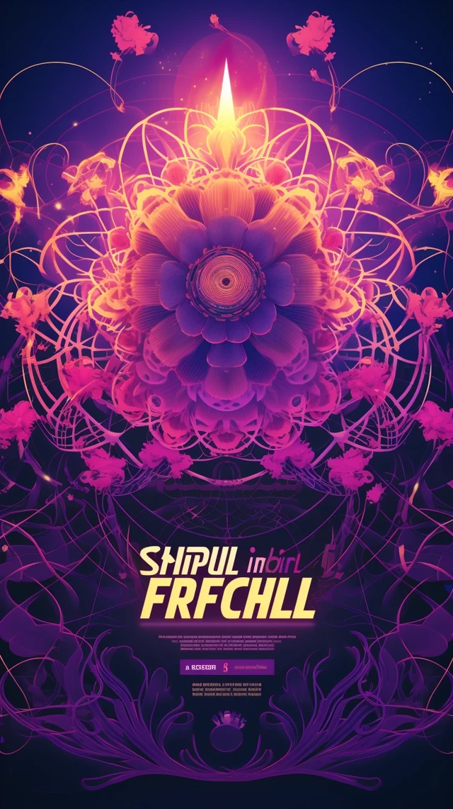
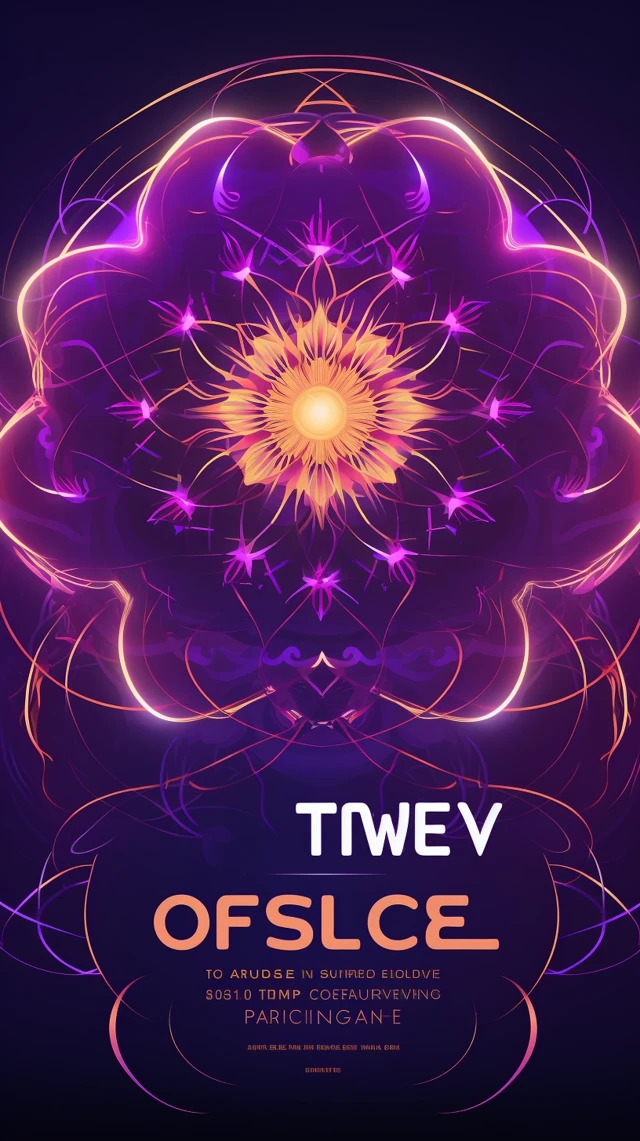
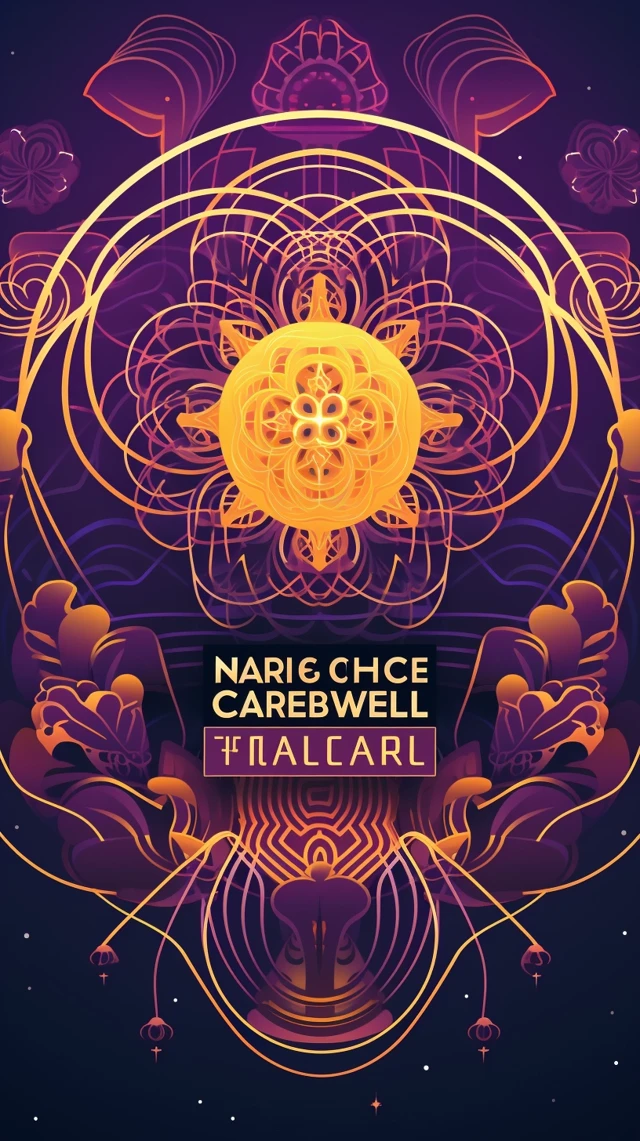
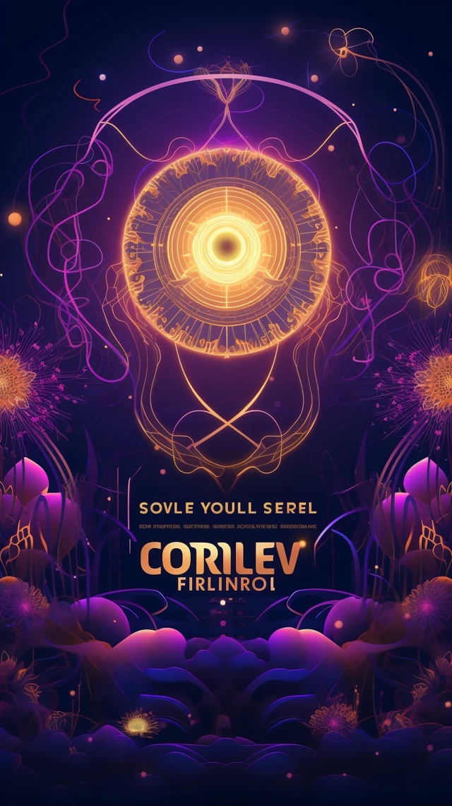
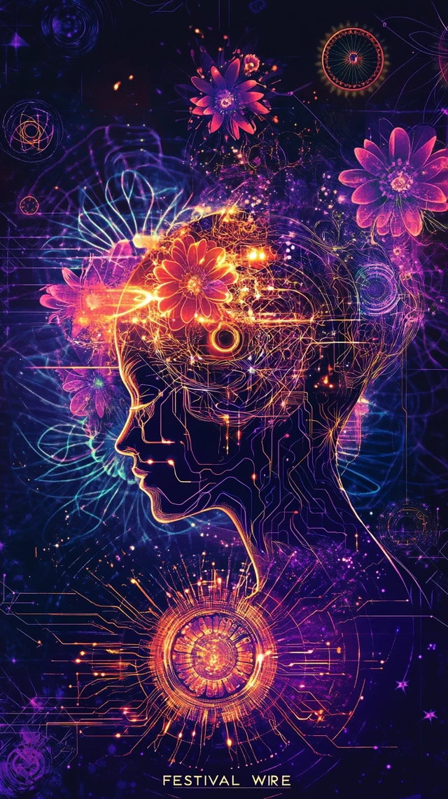
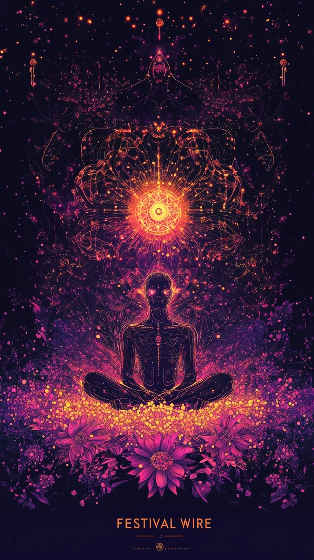
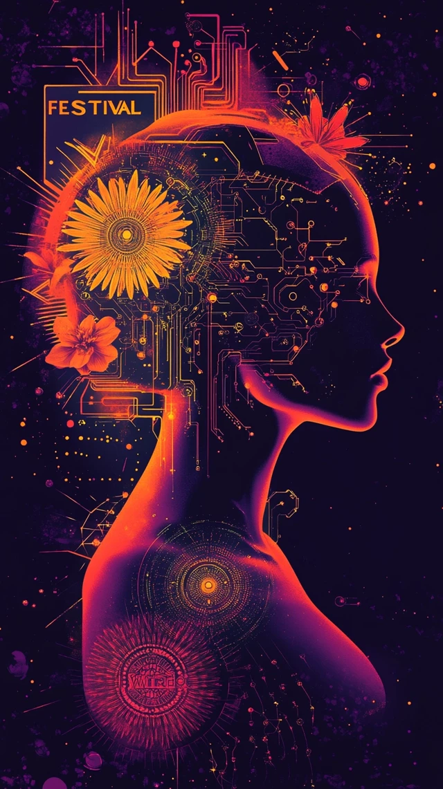
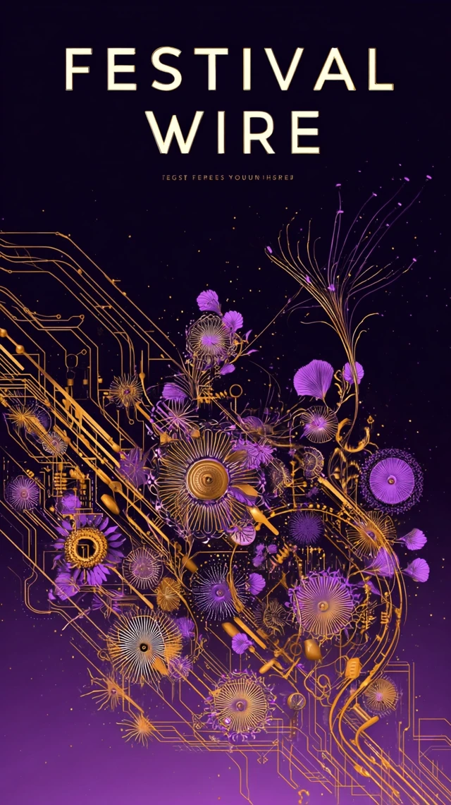
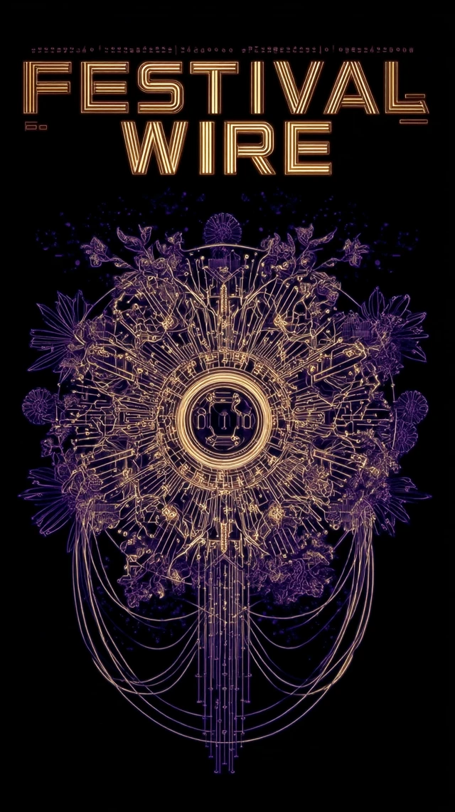
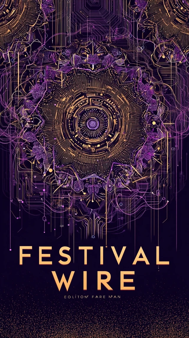
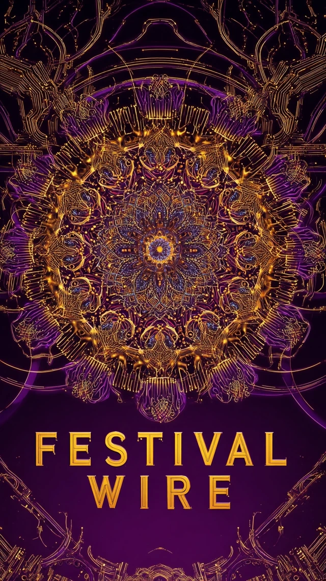
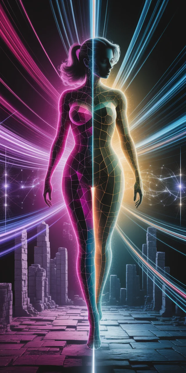
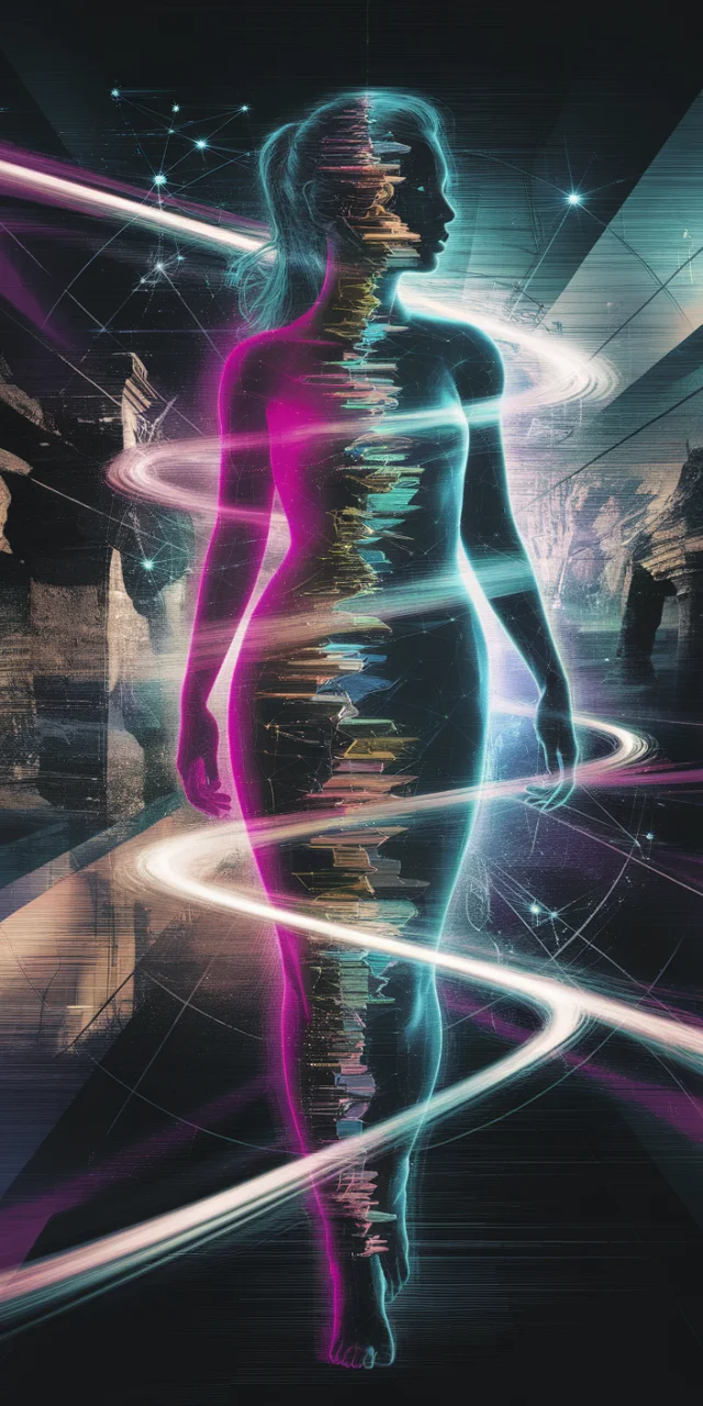
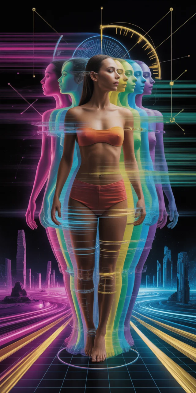
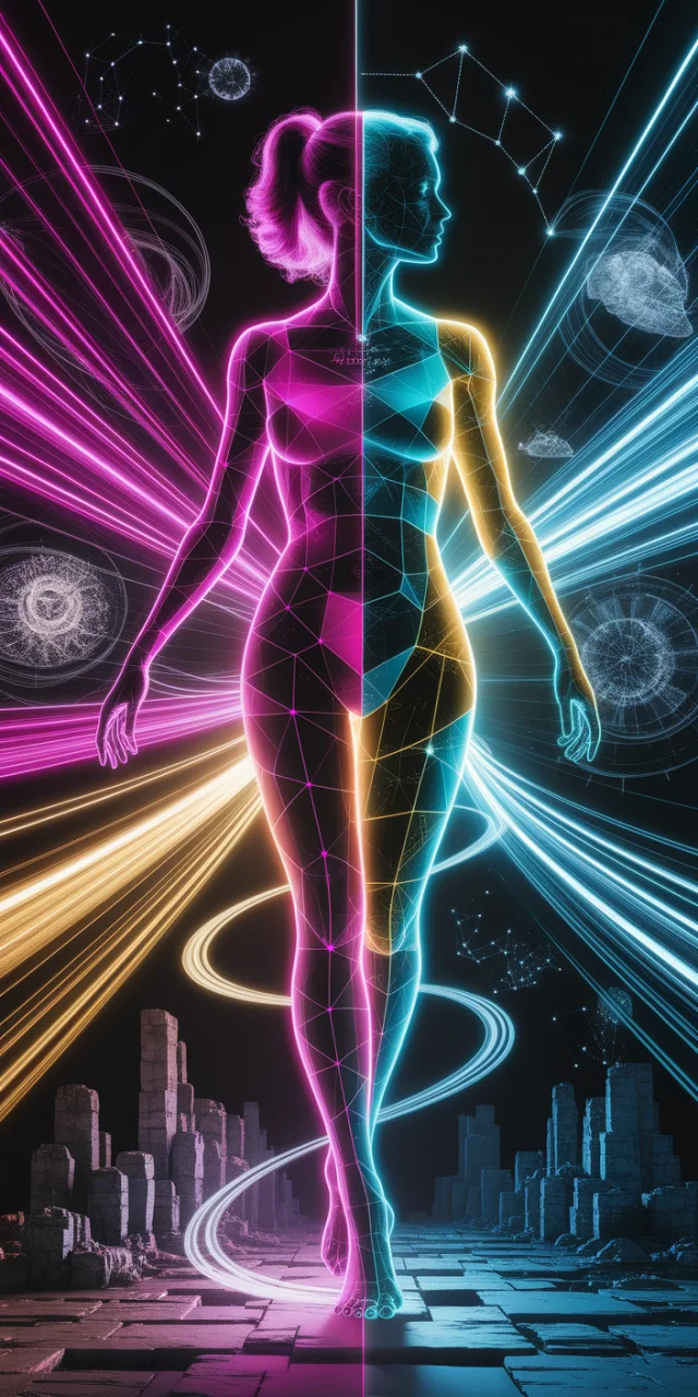
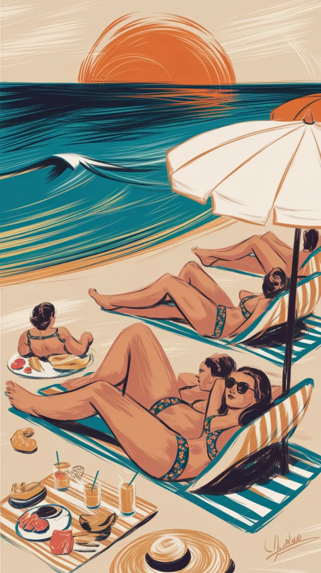
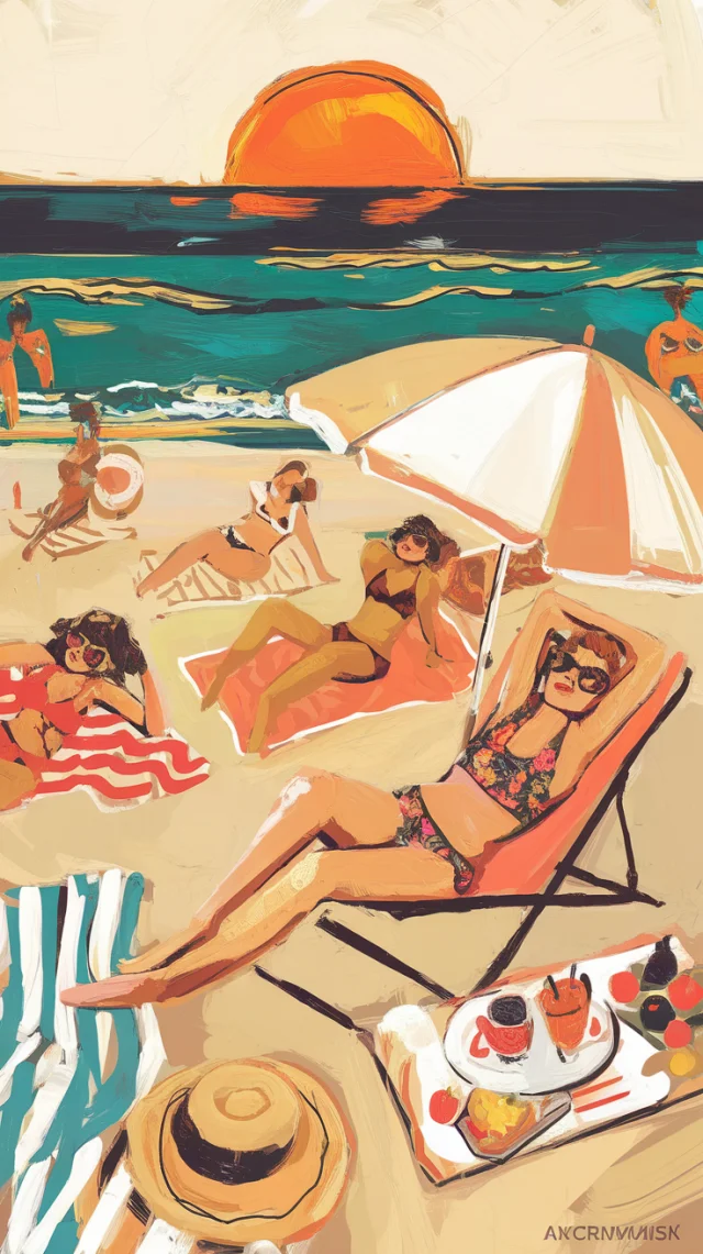
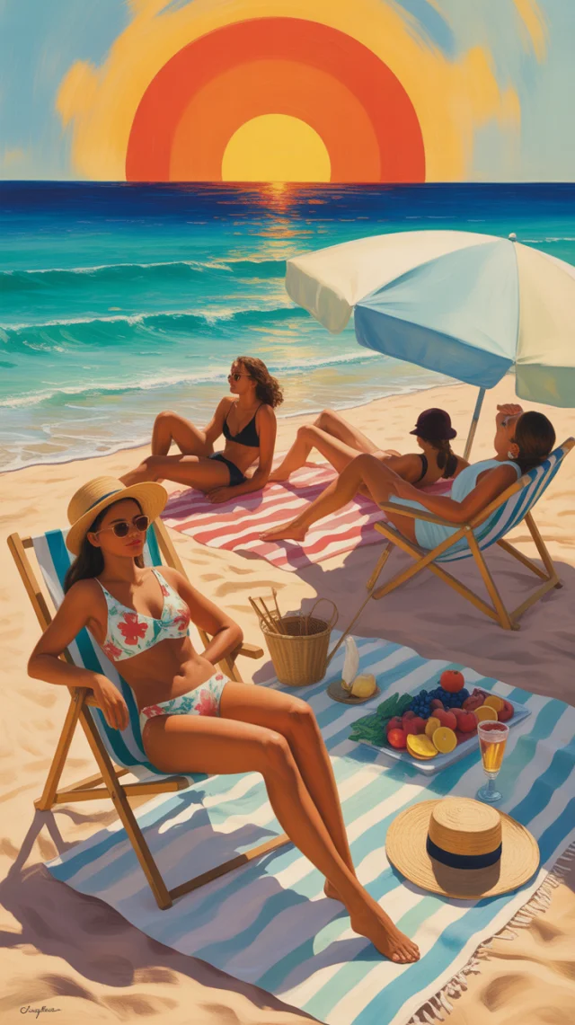
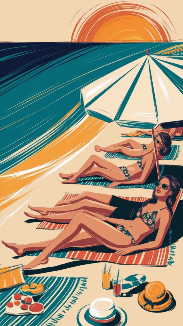
The evolution across MidJourney versions reveals dramatic improvements in Synthwave festival poster design capabilities. V5.2 excels in creating atmospheric, symmetrical mandala patterns with vibrant colors but struggles with coherent text rendering, producing nonsensical words. V6.1 introduces more balanced human elements and improved circuit integration, bridging technology and spirituality while slightly improving text legibility. V7.0 represents a significant leap forward with professionally rendered typography, perfect integration of circuit patterns with floral designs, and superior technical execution that maintains the philosophical Synthwave aesthetic while ensuring the 'FESTIVAL WIRE' branding is prominently featured and legible.

Recommendation

MidJourney v7.0 clearly delivers the most effective Synthwave festival poster designs, striking an ideal balance between artistic expression and practical marketing functionality. While v5.2 and v6.1 offer interesting aesthetic qualities, they fall short in typography rendering and balanced composition. V7.0's superior text clarity, sophisticated integration of circuit patterns with floral elements, and professional vector-like quality make it the definitive choice for creating compelling Synthwave festival promotional materials that successfully communicate both brand identity and philosophical aesthetic.

Actionable Tips

Prompt Improvements

  • Specify typography weight and style more precisely with terms like 'bold futuristic sans-serif' or 'thin neon outline typography' to ensure clearer text rendering
  • Add specific color hex codes for purple and gold to achieve more consistent color palette across generated images
  • Include 'maintain balance between technological and organic elements' to ensure the circuit and floral elements integrate harmoniously

Quick Tips

  • Use portrait orientation (9:16) to maximize vertical flow and create phone-friendly festival poster designs
  • Incorporate specific festival details (date, location) in the prompt to create more practical marketing materials
  • Emphasize 'clean typography' in your prompt to ensure festival name remains legible and central

Use Cases

Images generated with these prompts are ideal for:

Festival Marketing Materials

Creating cohesive visual branding for electronic music festivals that blend technology themes with spiritual aesthetics

Social Media Promotion

Generating eye-catching vertical format images optimized for Instagram Stories and TikTok to promote Synthwave music events

Album Artwork

Designing cover art for Synthwave music releases that incorporate the philosophical and technological themes present in the genre

Merchandise Design

Developing t-shirts, posters, and other merchandise featuring the distinctive circuit-floral fusion aesthetic for festival attendees

Visual Projection Backdrops

Creating animated versions of these designs as visual projections for live Synthwave performances

Website Design Elements

Incorporating these visual motifs into festival websites to maintain brand consistency across digital platforms